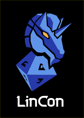
Today, after months of hush hush, we can finally present the new logo for LinCon!
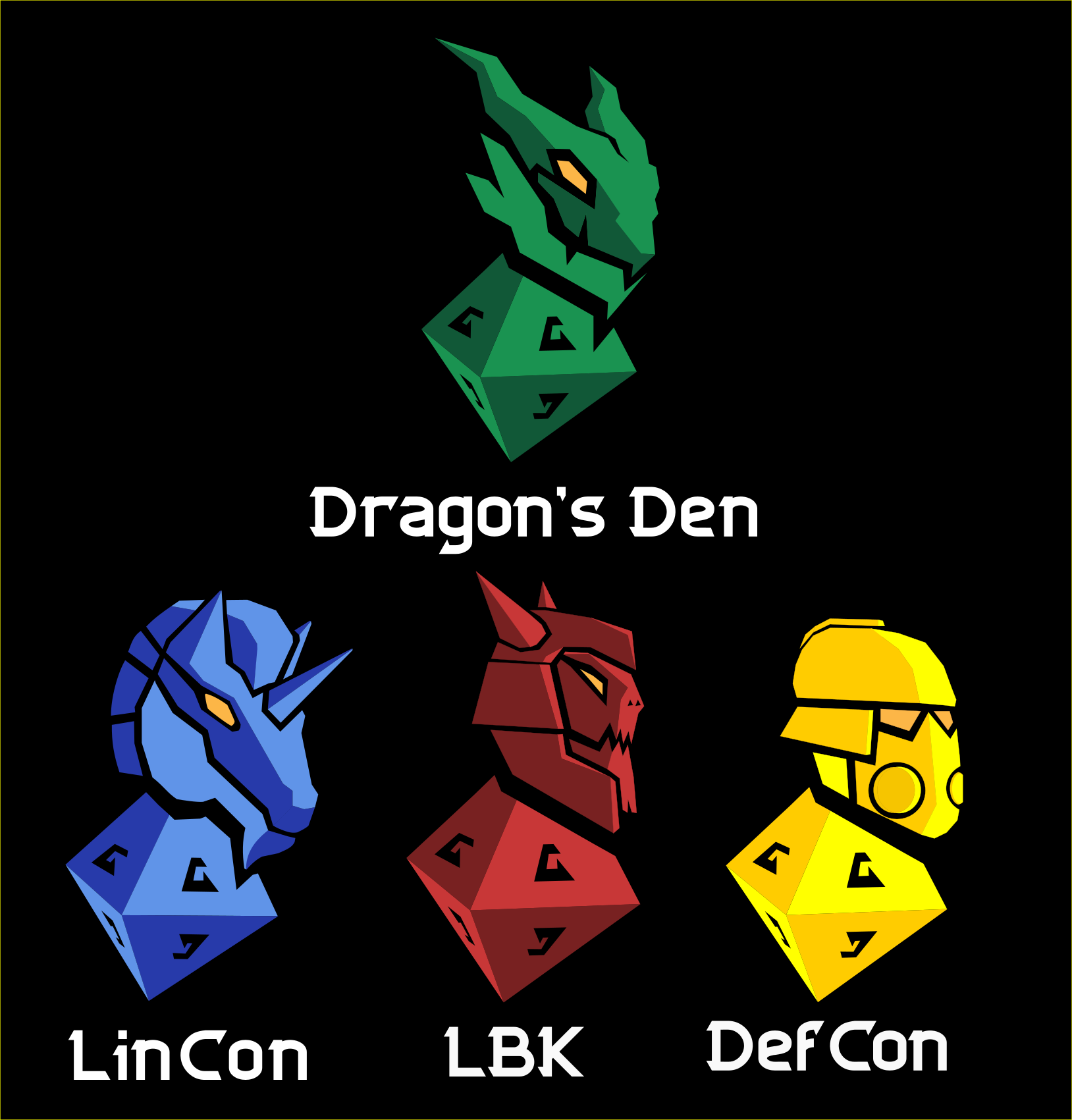
The change of logo takes place as part of the work to create a uniform profile for the entire association (instead of us having several different logos with different fonts from several different decades). The old LinCon logo was launched 25 years ago and has served well over those years.
The new logo still depicts a unicorn, but the style is now consistent with the association’s other logos. This means that the chess piece foot has been replaced by a die, which better represents our activities and the content of the convention. LinCon’s color will be blue, just like before.
With this, the family of logos is now complete (for the time being). Below you can see all the logos together, including the logo for our tabletop wargaming convention DefCon (which previously had no logo).