
A few years ago we replaced the Dragon’s Dens logo from the 80s with a new modern logo. The old logo was very advanced with many different colors, shapes and details, while the new (current) logo took inspiration from the much simpler logos for LBK and LinCon.
After a few years with the new logo, thoughts began to arise about developing a new logo for LBK in the same style as Dragon’s Dens, in order to create a more unified profile for the association and more clearly connect the two branches of the club. Now these thoughts have become reality!
The logo still depicts an Orc (to tie in with the association’s name and history), but the head has changed profile and now sits on a die just like Dragon’s Den’s dragon. LBK has now also received red as an official color (two different shades) and an official font.
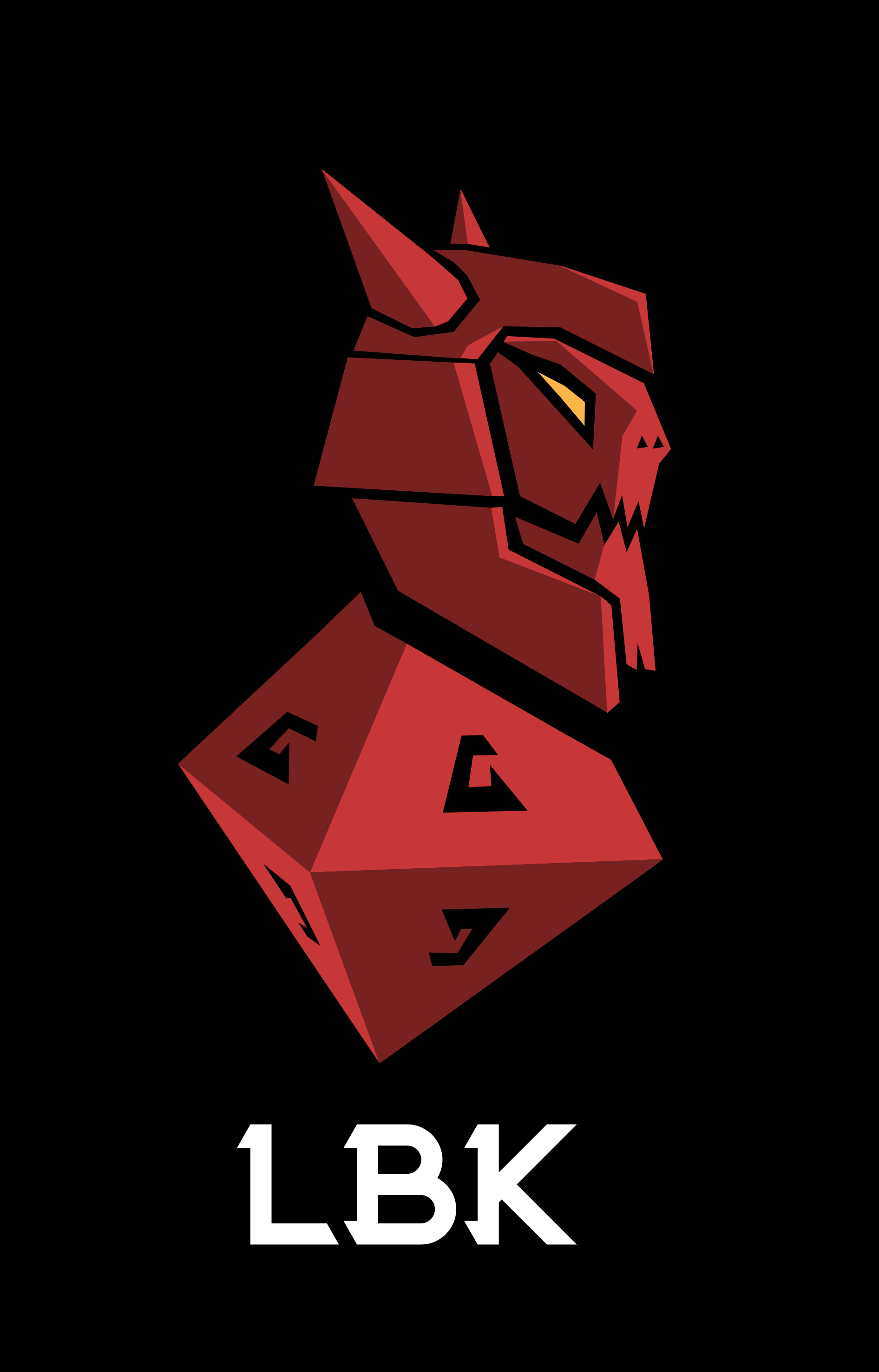
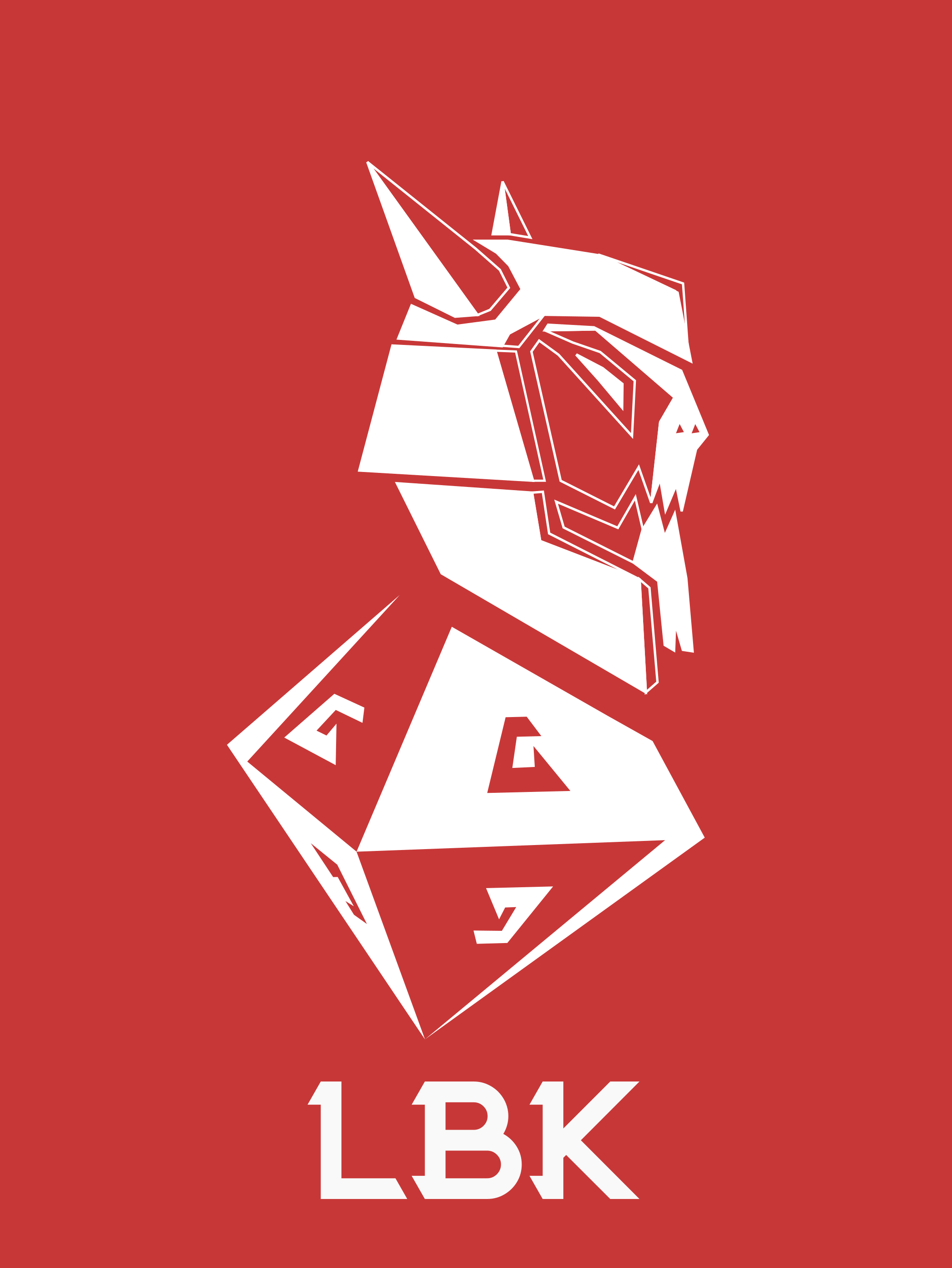
The new logo is also available in a single-color version for occasions where a multi-colored one may be impractical.
If you’re going to print something with LBK’s logo on it and need access to it in a suitable file format, contact styrelsen@dragonsden.se or Yabob on LBK’s Discord.